Most Australians know the economy is not working well. The GDP data show that Australia’s economy is growing, but many people feel that their living standards are not improving.
They are correct.
The most direct measure of living standards is real (inflation-adjusted) per capita GDP. Looking at the long-term trend of this measure, and its performance since the Albanese government took office in May 2022, we can see just how poorly this government is doing in making life better for the average Australian.
Australia’s economy is growing only because its population is growing, mainly due to immigration. That is not enough to make Australians better off.
The Cake Got Bigger, But Your Slice Didn’t
The chart below shows three series – aggregate real GDP, per capita real GDP, and population – each indexed to 100 from the first full quarter of the Albanese government in mid-2022. They are indexed in this way to show more clearly how each series has grown since then relative to each other.
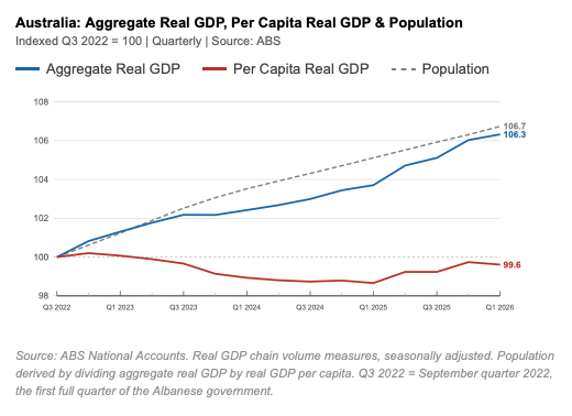
The chart shows that Australia’s economy, as measured by aggregate real GDP, has grown by a cumulative 6.3 percent since Labor took charge. But Australia’s population grew at a slightly faster pace over that period, up 6.7 per cent. That means that per capita real GDP is below where it was at the start of the period.
Put simply, Australians’ living standards have fallen under Labor.
There are, loosely speaking, two ways to grow an economy. The first is productivity growth: getting more output per worker through better technology, smarter organisation, and structural reform. This is what makes the average Australian genuinely better off. The second is population growth: simply adding more people. This makes the aggregate economy bigger, but it does not improve the living standards of those already here.
Think of it as a cake. If you scale up all the ingredients, you get a bigger cake. But if the number of people sharing it increases by exactly the same proportion, the average slice stays the same size. That is precisely what has happened under Albanese. The cake has grown because we added more ingredients – more people, mainly through immigration. But the average slice is no bigger than it was the day this government took office.
A government that understands this distinction would focus relentlessly on productivity – the reforms, investments, and structural changes that make each Australian worker more productive and each Australian household better off. After four years in office, there is no evidence that this government has any idea how to do that. Its only economic ‘strategy’ has been ‘add people make GDP go up’.
Fifty Years in Context
It is worth zooming out to put this record in its full historical context. The second chart tracks the same three series – aggregate real GDP, per capita real GDP, and population – but indexed from 1976, giving us a 50-year picture of how Australia’s economy has developed.
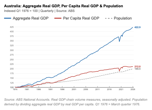
The arithmetic is straightforward. Over this period, Australia’s population has almost exactly doubled, while per capita real GDP increased by a little more than that. Combining those two factors, aggregate real GDP has more than quadrupled since 1976.
But these trends have not been uniform. Eyeballing this long-term chart, we can see that the gap between aggregate GDP and per capita GDP started to widen from the mid-2000s. This reflects the fact that population started rising at a faster pace as immigration picked up, while growth in per capita GDP began to weaken. The cake has been growing faster than the average slice.
So, this substantial underperformance in per capita real GDP growth is something that has been going on for around 20 years now, under both Labor and Coalition governments. But this long-term chart shows that the performance of the Albanese government has been particularly poor. And we can adjust the long-term chart to make that point even clearer.
A Historic Underachiever
The following chart shows how per capita real GDP grew under each government over the period since 1976. Instead of having a single base at the start of this period, the series is re-indexed to 100 at the first quarter after there has been a change of government. For clarity of presentation, the data for the quarter in which the change of government takes place are omitted.
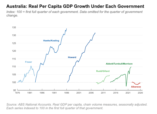
There have been six changes of government from one major party to the other over this period. Re-indexing real per capita GDP this way provides a clear visual summary of Australia’s recent economic history and allows us to see more clearly how living standards fared under each of these governments.
We can see in this chart the impact of all of the major economic shocks over the last 50 years – the early 1980s recession, the stock market crash and ‘the recession we had to have’, the Global Financial Crisis, and the Covid pandemic. But what is particularly striking about this chart is how starkly it shows the remarkable growth in real per capita GDP seen under the Hawke/Keating and Howard governments.
Real per capita GDP rose by over 30 per cent across the thirteen years of the Hawke/Keating government, notwithstanding a sustained dip in the middle of that period. This was an era of genuine economic reform: floating the dollar, opening up trade, deregulating the financial system, liberalising the labour market. These were difficult changes, but they undoubtedly succeeded in increasing living standards. The productivity dividend was real and sustained.
The Howard government built on that foundation. Real per capita GDP rose by more than 30 percent over these 11 years, supported initially by the continuation of productivity-enhancing reforms and then by the extraordinary tailwind of the mining boom as Chinese demand for Australian resources drove a surge in the terms of trade.
After Howard, the picture changes. The Rudd/Gillard period was impacted by the Global Financial Crisis, with per capita real GDP increasing by less than 5 per cent over six years. During the Abbott/Turnbull/Morrison period, per capita real GDP grew at a steady but subdued pace before the pandemic struck, and then subsequently bounced back sharply to end around ten percent higher at the end of the nine years of Coalition government.
So, for a variety of reasons, growth in Australia’s per capita real GDP has been weak over the last 20 years. Our economy has got bigger, but mainly because our population has grown. Productivity growth has tanked and that means the living standards of the average Australian have seen relatively little improvement.
The weaker productivity performance of the last two decades is an indictment of both major parties. Neither has found the policy answers that made the Hawke/Keating and Howard eras so strong.
But then there is Albanese.
The current Albanese government line in the chart is embarrassingly weak. It starts at 100, drops lower, and, by the first quarter of this year, is still below 100. This is the only government in these fifty years to deliver per capita real GDP that was lower at the end of its first term than it was at the start. And now, a year into Albanese’s second term, this measure is still below its starting point.
A Government Without a Plan
These three charts, taken together, demonstrate the fundamental failure of the Albanese government’s economic ‘strategy’.
The first chart shows the mechanism. This government has relied on immigration-driven population growth to boost GDP, instead of productivity growth. The government has chosen the easy lever – adding more people – rather than the difficult work of reform.
The second chart shows this is part of a longer trend of weakening per capita GDP growth, but the third chart shows very clearly that the performance under Albanese’s leadership has been particularly poor.
Australia is a wealthy, resourceful, and well-educated nation. It has delivered strong per capita GDP growth before. It can do so again. But that will require a government that understands the difference between making the cake bigger and making the slice bigger.
After four years, it is clear that this government is not that government. The charts do not lie. The Albanese government is an economic failure.