Patrick Heron’s paintings of the 1950s melt like ice creams. You want to run your tongue along the canvas and catch the drips. They capture a sense of summer holiday sea-and-scampi freedom. When Heron (1920–99) was five, his father, a blouse and silk-scarf manufacturer, moved from Leeds to St Ives in Cornwall. Heron played with the children of the potter Bernard Leach, and with Peter Lanyon, a friend from Sunnycroft primary school and a future painter, founded the Golden Harp Club, a society for the preservation of culture in England.
After the Slade School of Fine Art in London, Heron returned to St Ives in 1944 on an ‘approved placement’ for conscientious objectors at the Leach Pottery. He met Ben Nicholson, Barbara Hepworth and Naum Gabo. In 1956, he settled with his wife Delia at Eagle’s Nest in Zennor, a gorse-and-wildflower walk from St Ives. He talked of the garden ‘vibrating with camellias and azaleas’ in the summer. He remembered the ‘extraordinary effervescence’ of flowers ‘erupting all over the garden’. ‘Azalea Garden: May 1956’, in Tate St Ives’s permanent collection, is a hotly shimmering curtain-raiser to the gallery’s Patrick Heron retrospective. Stop and sun your face against it on your way in.
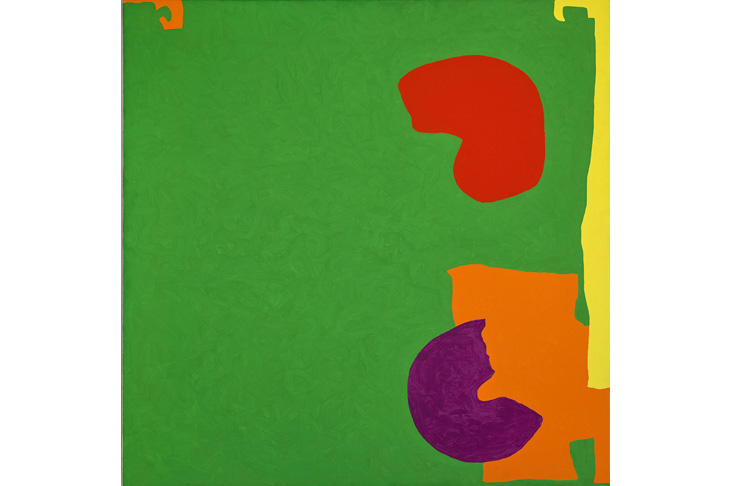
Heron insisted that looking at a painting was an active, not a passive thing. Your eye must circle, sweep, jump. His colours dance, pulse and boff you on the nose. His exhilarating joy in colour is catching. The painting that had a greater influence on his work than any other was Henri Matisse’s ‘The Red Studio’ (1911), which Heron visited repeatedly when it was shown at the Redfern Gallery in London in 1944. He was fascinated by Matisse’s planes of unmixed colours, which, with a sleight of hand and brush, give the illusion of depth. He coined a term ‘unflatness’ to do justice to colours that push and pull. His titles revel in colour: ‘Green and Mauve Horizontals: January 1958’; ‘Violet in Dull Green: July 1959’; ‘Big Complex Diagonal with Emeralds and Reds: March 1972 — September 1974’; ‘Vermillion and Ultramarine: June 11: 1985.’
Being an old stick-in-the-mud, I have put those paintings in chronological order. The exhibition does not. Heron’s work over 50 years is organised into four gnomic, nonsense-rhyme themes ‘Asymmetry and Recomplication’; ‘Explicit Space’; ‘Edges’; ‘Unity of the Work’. This makes for an exhibition that is infuriating rather than illuminating and that does a disservice to the richness of Heron’s work. It seems particularly perverse when Heron was so precise about dating his paintings in their titles. Not every exhibition need follow a dogged timeline — Edward Bawden at Dulwich Picture Gallery confidently, wittily, organises itself into themes — but in a life’s survey such as this, where certain paintings so obviously belong together — one fellow visitor walked from room to room, muttering ‘so this goes with that, and that one with this one’ — it is a block to understanding. The words ‘dis-chronology’ and ‘a-chronology’ — Tate aren’t the only culprits — should be banned.
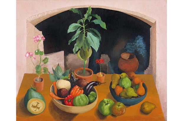
Paintings from different decades are jelly-jumbled together like coloured Haribo, M&Ms and Liquorice Allsorts. If you have a tidy, logical mind you want to pick them out and put them in their proper groups. Since you cannot start taking paintings off the wall of the light and subtly sympathetic Jamie Fobert Architects extension, which for the first time gives Tate St Ives the space it needs for Heron’s largest canvases such as ‘Christmas Eve: 1951’, a scene of messy bustle and expectancy — you must draw the links and plot the periods yourself.
One other groan: the dimensions of each painting are given in the catalogue in centimetres. Does 182.9 x 304.8 give you any sense of the scale of a painting like ‘Christmas Eve: 1951’? Wouldn’t 6ft x 10ft and 6.5ft x 13ft (in brackets) be more helpful?
Heron talked of the edges of a painting as a ‘springboard’. Why should any part of a painting be more important that any other? The margins were no less vital than the centre. His amorphous shapes, his bits-and-blobs drift to the boundaries of the canvas, like balloons let go after a party. You want so much to know where they are floating, what is happening in the wings of the picture plane, noises off.
Heron rebelled against paintings whose backgrounds had a ‘left-over look’. It is what makes his most successful paintings so exciting, like sugar-rush shots of freshly squeezed orange juice. Colours collide: traffic light reds and greens, oranges and lemons, aubergines against deep blue seas.
Got something to add? Join the discussion and comment below.
You might disagree with half of it, but you’ll enjoy reading all of it. Try your first month for free, then just $2 a week for the remainder of your first year.