There is, of course, no endeavour, no craft, no profession, no trade that neglects to ‘reflect society’. This is a commonplace. The collective narcissism of considerate builders, for instance, claims that hod carriers and brickwork reflect society. The contention of Menu Design in Europe is kindred. Graphic artists, restaurateurs, decorators and chefs have, through two centuries, expanded their capabilities according to the milieux in which they have practised. Menus are, then, not merely functional lists, they are self-advertisements, exhibitions, seductions and, occasionally, desirable objects that are apparently collectible.
Indeed this book has the unmistakable feel of an obsessive’s scrapbook, a completist’s trophy. The completist in question is Taschen’s California editor Jim Heimann. The majority of the images in this 450-page blunt weapon are from his collection. He also collects non-specific Americana: surfing memorabilia, toys, photos of googie roadside architecture, advertising ephemera (which ceases to be ephemeral once his curatorial hand has granted it everlastingness). There is not much writing here. Heimann is largely mute. However, the startlingly prolific design journalist and historian of typography Steven Heller provides a brief introduction. It begins off-puttingly:
Hungry? Crave variety? Try Europe! Europe is arguably the largest food court in the world. Comprising haute cuisine and common repast – most of it delicious – the continent is a mecca for star chefs and a cornucopia of gustatory delights. One might say that Europe is an immense smorgasbord-cum-moveable-feast, continuously changing its fare…
One might indeed but one might, equally, choose not to adopt the gee-whizz jocularity of easily impressed American food ‘writers’. He concludes: ‘A beautiful menu will not make a dish taste better, but it will make the dining experience a total experience.’ That total experience will make me wince.
 French dinner menus from c.1906 (right) and 1916 (left). Courtesy of the Jim Heimann Collection.
The captions to the images are provided by Marc Selvaggio, a Berkeley bookseller and dealer in ephemera. A daunting task given that the majority of illustrators are not known. Menu cards were seldom signed. And even when they were, the signature was, and remains, difficult to decipher. But far from impossible. With a modicum of research the anonymous artists can be given a name and thus, tardily and temporarily, a blast of posthumous fanfare. It is vaguely insulting to the shades of Alfred Mailick, Georges Redon (no relation), the fabulously camp Guy Arnoux, the poet of Glaswegian backlands Robert Eadie and the engraver Valentin Le Campion (an urban Tunnicliffe) not to identify them. They are admittedly of local and specialist interest. That cannot be said of Paul Delvaux, internationally famous but not, apparently, chez Selvaggio.
The most glaring instance of failed acknowledgment is this fetishistic Belgian painter’s unmistakable design for La Couronne in ‘Brussels, Belgium’ (rather, I guess, than Brussels, Orange County). It is even signed, though it needn’t be. Delvaux’s signature is in his every mark, including his dedication in April 1954 to Albert and Georges Niels, proprietors of La Couronne and members of a restaurant dynasty whose grandchildren still own several Bruxellois establishments including the excellent Le Canterbury, lurking behind gesticulating pollards on the banks of the Ixelles ponds. The cooking is memorably good but the menu is entirely forgettable. The same might be said of most menus of the past half-century.
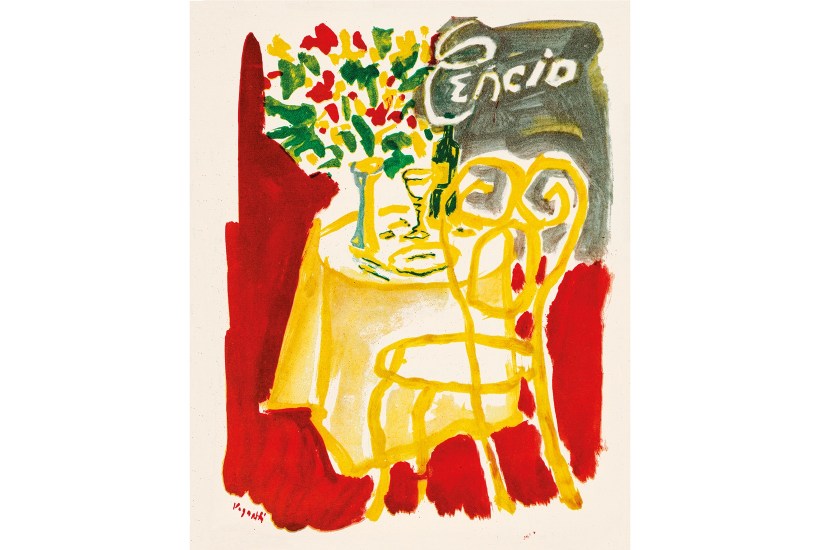
 Jean Cocteau’s menu design for Le Grand Véfour, 1969, Paris. Courtesy of the Jim Heimann Collection.
There are exceptions. Lameloise in the small Burgundian town of Chagny is by some distance the worst restaurant with three worthless Michelin stars that I have been to. It was so conceited in the mid-1980s that its menu just spelled out the place’s name in Diane, the only boring font that the incomparable Roger Excoffon designed.
The later years of this survey are over-represented by what may have been a job lot from the militaristic DDR with a few makeweights from the rest of the Soviet bloc (some of them recycled from the same publisher’s Beyond the Wall). Honecker most enjoyed he-man meals of what he had just hunted. He was, of course, atypical. The average Ossie enjoyed an industrial, processed diet with plentiful paprika crisps. But still a better one than that of his Czech comrades.
Even after Chemnitz’s name had been changed to Karl-Marx-Stadt, its grandish hotel remained the Chemnitzer Hof. Its menu for New Year’s Eve 1960 promised the clichéd, san serif elegance of cocktails and ‘sophistication’ of perhaps 30 years earlier, a fantasy elegance seldom achievable in the land of Trabis, high-tar cigarettes, Milchbars and nylon shirts. That variety of escapism was suceeded by a frolicking, jokey, folksy reaction to modernism, which was still in evidence several years after reunification.
In the mid-1990s the fabric of quotidian life suggested that the ‘former’ east was not really former at all. East of the Elbe it all looked, smelled and tasted like the old indigent DDR which was already inciting ostalgie. A comforting clumsiness infected packaging, colour-blind fabrics, fat lava ceramics, childlike posters, glassware, excitingly patterned housecoats and menus littered with anthropomorphic animals, anthropomorphic cartoon figures, puppets, diagrammatic samovars and onion domes (Russian restaurants) and guitars (Cuban). Most of it hinting at rejection of the material paradise that had before 1989 been the cynosure of, say, Magdeburg and Dresden: a promise broken, a delusion shattered.
But while parochial snugness and staid domesticity characterised menus and restaurants, the architecture of the hotels that housed many of those restaurants was becoming ever more wild. After decades of the functional, cheap, prefabricated idiom deprecated as Khrushchyovka, the later years of his successor’s reign were the years of the Leonid Brezhnev Plays Vegas style, a farouche late-modernist school with countless variants, no rules and no aesthetic controls. Had it been read right it would have predicted the forthcoming fragmentation of the Soviet Union.
What does a current English menu predict? The eventual end of the upper case, the disappearance of punctuation and pound signs? It fits with ‘democratic’ open kitchens, non-hierarchical hard surfaces, physical discomfort, the pretence of communality, screaming minmalism and the vague sanctimony of a chef caste that has no taste for sybaritism and is vegan under the skin.
Try this – and enjoy:
cerumen foraged surls crusted craith tallow brioche 17
mallow wibs tunstall bache wax tan sourced water 26
coypu treacle birch bark salients chlorophyl popcorn 29
Got something to add? Join the discussion and comment below.
Menu Design in Europe, edited by Jim Heimann, is published by Taschen.
You might disagree with half of it, but you’ll enjoy reading all of it. Try your first month for free, then just $2 a week for the remainder of your first year.