The strange and faintly sinister works of the Belgian artist Léon Spilliaert have been compared — not unreasonably — to those of many writers, Edgar Allan Poe among them. But as I walked round the Spilliaert exhibition at the Royal Academy, it was not any of these that came to my mind. It was the Father Brown detective stories by G.K. Chesterton.
I wasn’t thinking of the neatly paradoxical plots, but rather of Chesterton’s mastery of atmosphere. Consider The Absence of Mr Glass (1914), which takes place in a ‘desolate’ seaside resort. As Father Brown investigates, ‘…the afternoon was closing with a premature and partly lurid twilight; the sea was of an inky purple and murmuring ominously’.
This could be a description of a Spilliaert, the master — as it turns out — of haunted Edwardian seascapes. He spent his most productive years in Ostend, a sort of Belgian Brighton with royal connections and a cheery, seedy atmosphere. He was born there in 1881 and — on the evidence of this exhibition — did almost all his best work in the town.
Much of it belongs to a short period in Spilliaert’s twenties, during which he was lonely, ill and suffering from chronic insomnia. The RA show includes an array of self-portraits: haggard, wild-eyed and with an air of gloomy desperation. These were drawn by night in his studio, its windows opaque black.
Spilliaert, though an eccentric loner (or perhaps because of it), is nonetheless recognisably Belgian in mood. There are even moments, such as the way the ripples are a maze of crinkly, swirling lines when he brings to mind another great compatriot, Hergé, the creator of Tintin.
His work looks forward to the surrealism of Magritte and back to James Ensor, a celebrated, older artist who was also living in Ostend. Spilliaert did not imitate the older man’s obsession with carnivals and masks, but there was a connection between the two: an underlying sense of weirdness. Despite this affinity, Ensor does not seem to have welcomed Spilliaert’s attempts at friendship. ‘No sooner do I open my door,’ he complained, ‘than his delicate silhouette appears.’
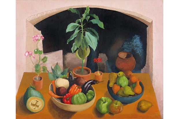
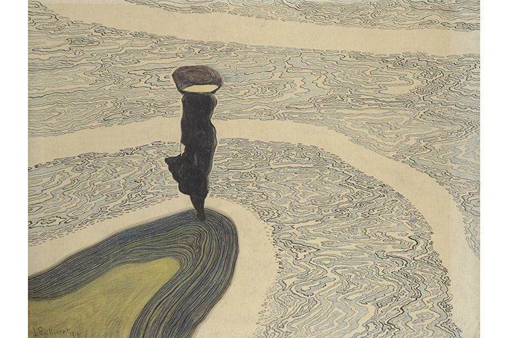
Spilliaert would often go for solitary walks along the promenade, and he looked down from his workplace on to the fisherman’s quay on the North Sea, which stretched to the horizon. The resulting pictures belong to a northern tradition, which includes Munch and Friedrich, of stark confrontation with a cold and infinite sea. Spilliaert’s seascapes such as ‘Breakwater with Pole’ or ‘Signal from the Pier’ (both 1907) are pared down to almost abstract geometry, and nearly monochromic. He also specialised in a genre you might call the spectral still-life. ‘Flasks’ (1909) is a drawing of three bottles on a shelf; it’s completely naturalistic, but somehow, perhaps because of its inky darkness, exudes an atmosphere of disquiet.
After a disappointing war — he joined the civic guard, but was expelled for accidentally taking aim at a Belgian soldier — Spilliaert fell in love and married. Although he lived for another 30 years, this domestic happiness marked the end of his inspiration as well as his angst-ridden, reclusive life.
On this showing, he was an uneven, repetitious and limited artist. Even so, like the Finnish painter Helene Schjerfbeck, whose work was shown at the RA last year, he was a poetic north European painter who deserves to be much better known in this country.
Spilliaert’s approach — bold, simplified shapes, limited colour range — lent itself to printmaking and book illustrations (there are a number of the latter on show). Over at the British Museum Print room, French Impressions: prints from Manet to Cézanne makes the point that not every great painter could — or indeed wanted to — translate their art from canvas to etching or lithography. Cézanne and Van Gogh were scarcely interested in print media, but Gauguin and Degas were both as brilliant and innovative as printmakers as they were with paints. Manet, like his idol Goya, was able to distill the essence of his art into black-and-white prints. While Toulouse-Lautrec, who was not in the class of those others as a painter, was at his best as a poster designer. He shines in this display.
Also at the British Museum there is a pioneering little show devoted to Piranesi’s drawings. This marks the 300th anniversary of the birth of the versatile Italian — architect, dealer in antiquities, and master printmaker. A teacher once warned him: ‘You are too much a painter, my friend, to be an engraver.’ But this delightful exhibition demonstrates the opposite. Piranesi, who came from Venice, drew with the brio of Tiepolo. His preparatory sketches fizz with freedom. But it was the way he was able to condense that energy into the final image that make his prints so powerful.
Got something to add? Join the discussion and comment below.
You might disagree with half of it, but you’ll enjoy reading all of it. Try your first month for free, then just $2 a week for the remainder of your first year.