I learnt to splash about in watercolour at my grandmother’s knee. Or rather, sitting beside her crouched over a pad of thickly ‘toothed’ paper and a Winsor & Newton paintbox on a wind-swept East Anglian seashore. Now, looking back, I see that what she was doing belonged to a tradition. Her predecessors, idols and reference points are to be seen in an admirable small exhibition at the Fitzwilliam Museum, Cambridge, Watercolour — Elements of nature.
This consists of works from the museum’s collection, but is much more full of delightful surprises — even for those who know the Fitzwilliam well — than that description suggests. The reason is that, while most British galleries own plenty of watercolours, you don’t often see them because they are fragile. Exposed to light, the paper turns yellow and the colours fade.
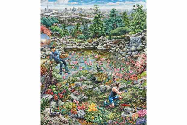
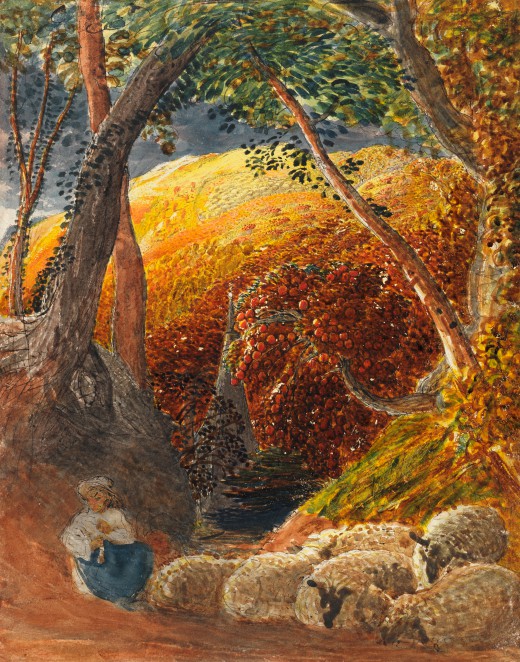
This is presumably why, although Samuel Palmer’s ‘The Magic Apple Tree’, c. 1830, is one of the Fitzwilliam’s most compelling possessions — a masterpiece of visionary rustic romanticism — it is not always to be seen on display. It is now, though, as are numerous pictures that I don’t recall ever spotting in decades of visiting the Fitz.
These are not exclusively British — the selection includes French flower painting, impressionist and post-impressionist works — but a lot of them are. Watercolour became a national speciality in the late Georgian and Victorian eras. One reason sometimes advanced for this is that watercolour is perfectly adapted to the depiction of a climate that largely consists of differing degrees of wetness.
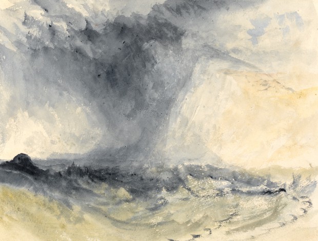
Turner’s ‘Shakespeare Cliff, Dover’ (c. 1825) is a perfect case in point. It represents almost nothing solid. The chalk outcrop of the title is a ghostly presence consisting of a patch of white paper given form by a few faint veils of blue-grey wash. The rest of the picture is made up of varying intensity of the same: dark, almost black in places on the surface of a stormy sea and the clouds above. In the centre, the real centre of the picture, is a whirling vortex of lashing rain.
Of course, there is no single correct way to paint with watercolour. On show are diverse ways of using pigment diluted with water. Portrait miniatures — such as Nicholas Hilliard’s ‘Henry Percy’ (c. 1595), an Elizabethan intellectual reclining in a flowery meadow, open book behind him — are precisely detailed rather than loosely washy. So too are Ruskin’s studies of rocks and leaves, as sharply focussed as a daguerreotype.
If desired, substances such as flour and gum could be added to make the colours thicker: Palmer and Cotman both did this. On the other hand, the watery medium does not suit those who prefer to build up layer after layer of pigment, revising and changing. Constable was a natural painter in oils; his watercolours, such as ‘Windermere’ (1806), while perfectly accomplished, don’t seem truly him. Turner, conversely, seems most himself in watercolour.
Several paintings on show are almost Chinese in the way they conjure up a whole world with a few quick strokes of the brush. A sketch of a tree and hull of a boat at mooring by Peter De Wint (1784-1849) creates a riverbank and its reflection in the water below from one almost continuous but subtly inflected greenish blob: virtuoso fluidity.
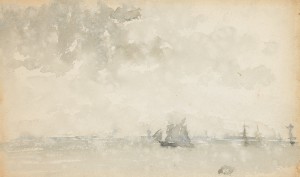
Whistler’s ‘Grey and Silver — North Sea’ (c. 1884) is close to not being there at all, so faint are the pale washes that make up a maritime panorama, with just a sailing boat in the centre to anchor it in reality. Looking at it, I realised that this was the kind of effect my grandmother, trained at art school in the first part of the 20th century, must have been aiming at all those years ago.
Transparency is also the key to the art of Larry Bell, an American whose work is on show at White Cube, Mason’s Yard, London SW1. Bell (b. 1939) is one of a number of Californian artists whose work is actually formed from those staple ingredients of so many pictures, light and space.
James Turrell, the best-known of these, uses light alone. Bell’s output is typically a little more substantial, but not much. His most characteristic pieces are made from glass, specially coated both to reflect and absorb light so that their surfaces appear simultaneously there and not there.
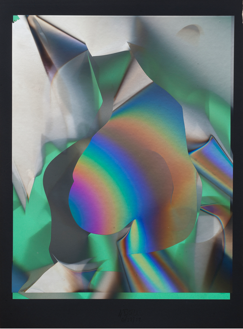
On show at White Cube there are iridescent curvilinear shapes suspended in boxes, a maze of semi-transparent partitions, and a shelf placed in the corner of the room illuminated in such a way as to throw a double cone of light onto the wall, with multiple spectrums of colour like a butterfly’s wing above it. In other words, Bell has made a sort of sculpture from a rainbow. Turner might have been interested.
Got something to add? Join the discussion and comment below.
You might disagree with half of it, but you’ll enjoy reading all of it. Try your first month for free, then just $2 a week for the remainder of your first year.