As the Austrian School economists know, inflation distorts price signals unevenly. It may be tempting to try to filter out inflation from any given good or service to find its real price had the currency supply never been inflated in the first place, but this is impossible given the uneven effects. Inflationary effects on prices cannot truly be isolated and controlled for.
But what about money itself? Meaning, what about gold? Currency is always inflated on top of the existing money (currently gold) supply, so the price of gold is actually what is being falsely inflated. Therefore, controlling the price of money itself in order to find the real price (which could be seen as gold’s real purchasing power) sans inflation is much more plausible by numerical or statistical analysis.
From an analysis of gold priced in terms of 1959 USD, which in effect strips out the inflation effect on the gold/dollar exchange rate, there is a massive consolidating triangle pattern going back to 1980 that is reaching its apex. From an analysis of this pattern, it seems that gold is about to break out to the upside in current dollar terms. Below we explain how we came to this conclusion.
Chart 1 is a plot of the USD M2 currency supply from 1959 to December 2023. The dashed curve (1) is an exponential fit to that data from 1959 to 2020. The data after the 2020 Covid Pandemic does not follow the exponential trend line due to the extreme credit creation via quantitative easing (QE4) in the Covid years. Therefore we have used a 5th-order polynomial fit, dashed curve (2), to model the expansion of the M2 money supply. That is, we have had to treat these two periods, pre and post-2020, separately.
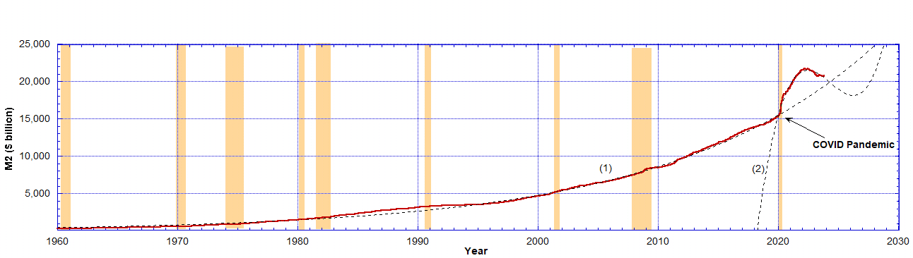 Chart 1: The red data are the M2 currency supply data for 1959–2023 from the Board of Governors of the Federal Reserve System, statistical release H.6. Money Stock Measures, via FRED. The dashed curve (1) is an exponential fit to the data between 1959 and 2020. The dashed curve (2) is a 5th-order polynomial fit to the data after 2020 up to December 2023. After normalisation, the M2 supply becomes essentially constant (not shown). Sepia strips indicate recessions.
From Chart 1, we used the exponential fit curve, the dashed line (1), to normalise US dollars to 1959 dollars, up to 2020. $1 in 1959 inflates according to the exponential red curve (1) in Chart 2. Because the M2 currency supply after 2020 departs strongly from the exponential in Chart 1 we have piece-wise separately modelled the M2 money supply between 2020 and 2024 using the blue polynomial curve (2). This is to compensate for the absolutely unprecedented additional currency flooded into the market from the Covid period. Due to QT in 2023 curve (2) is now approaching the theoretical value of curve (1) in late 2023.
Chart 1: The red data are the M2 currency supply data for 1959–2023 from the Board of Governors of the Federal Reserve System, statistical release H.6. Money Stock Measures, via FRED. The dashed curve (1) is an exponential fit to the data between 1959 and 2020. The dashed curve (2) is a 5th-order polynomial fit to the data after 2020 up to December 2023. After normalisation, the M2 supply becomes essentially constant (not shown). Sepia strips indicate recessions.
From Chart 1, we used the exponential fit curve, the dashed line (1), to normalise US dollars to 1959 dollars, up to 2020. $1 in 1959 inflates according to the exponential red curve (1) in Chart 2. Because the M2 currency supply after 2020 departs strongly from the exponential in Chart 1 we have piece-wise separately modelled the M2 money supply between 2020 and 2024 using the blue polynomial curve (2). This is to compensate for the absolutely unprecedented additional currency flooded into the market from the Covid period. Due to QT in 2023 curve (2) is now approaching the theoretical value of curve (1) in late 2023.
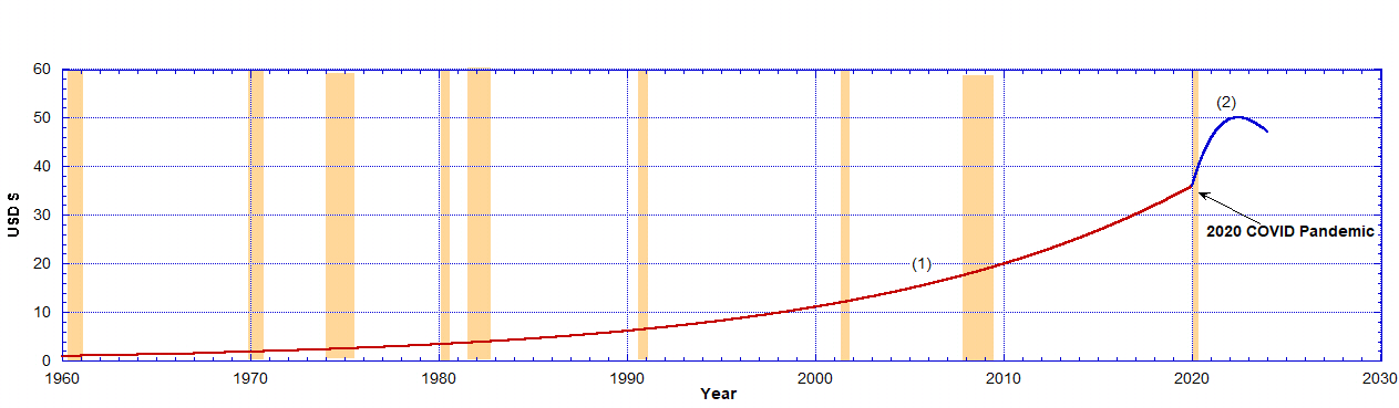 Chart 2: $1 in 1959 will deflate by the exponential (red) curve followed by the blue curve (2) as shown. This is the price inflation of 1/35 oz of gold over this time period resulting only from the expansion of the M2 currency supply. Thus the gold price is inflated by a factor of 47 by the end of 2023 in terms of current dollars. This means that the USD has lost about 98 per cent of its value in the last 65 years. If the price of gold remains constant in terms of 1959 dollars then its current price is only rising due to inflation. However, after 2020 the anomalous curve (2) had to be used to allow for the massive additional deflation of the dollar’s value in that period.
Using the curves (1) + (2) for normalised 1959 dollars, from Chart 2, we have plotted in Chart 3 the normalised price of gold as a function of time in years from 1959 to December 2023. By dividing the price of an ounce of gold by the dollar inflation factor from Chart 2, we get the price of an ounce of gold in 1959 dollars. As a result, we have the price of gold over 65 years priced in 1959 dollars. The colour-coding for the red and blue data is merely maintained to show the respective periods where either the red curve (1) or the blue curve (2) has been used to calculate the gold price in 1959 dollars.
Chart 2: $1 in 1959 will deflate by the exponential (red) curve followed by the blue curve (2) as shown. This is the price inflation of 1/35 oz of gold over this time period resulting only from the expansion of the M2 currency supply. Thus the gold price is inflated by a factor of 47 by the end of 2023 in terms of current dollars. This means that the USD has lost about 98 per cent of its value in the last 65 years. If the price of gold remains constant in terms of 1959 dollars then its current price is only rising due to inflation. However, after 2020 the anomalous curve (2) had to be used to allow for the massive additional deflation of the dollar’s value in that period.
Using the curves (1) + (2) for normalised 1959 dollars, from Chart 2, we have plotted in Chart 3 the normalised price of gold as a function of time in years from 1959 to December 2023. By dividing the price of an ounce of gold by the dollar inflation factor from Chart 2, we get the price of an ounce of gold in 1959 dollars. As a result, we have the price of gold over 65 years priced in 1959 dollars. The colour-coding for the red and blue data is merely maintained to show the respective periods where either the red curve (1) or the blue curve (2) has been used to calculate the gold price in 1959 dollars.
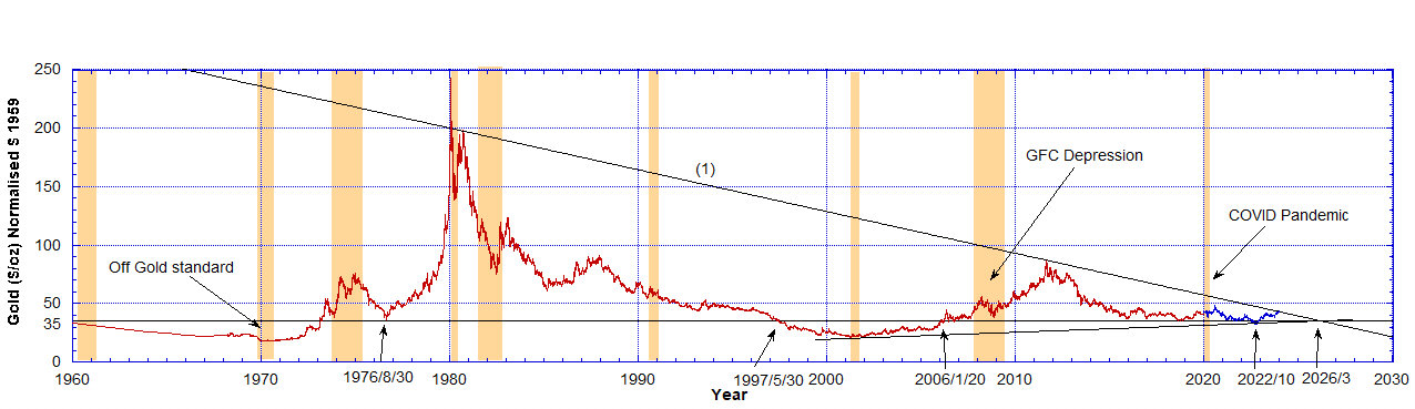 Chart 3: The price of an ounce of gold in 1959 dollars. The red data are the price of gold ($/oz) scaled by the USD normalisation curve from Chart 2 using curve (1) and the blue data are scaled using curve (2). The historical gold price data were downloaded from Auronum, the National Mining Association and YCharts. The horizontal solid line is the $35 price for an ounce of gold from 1959. The descending solid straight line (1) touches the tips of the peaks except in 1980 where a few points break above it. The bottom ascending solid line, in two places, touches the minimal gold price and also coincides with the same apex point in 2026. The sepia strips indicate recessions.
Before 1970, we were on the gold standard and the price of gold was essentially constant while currency was being created. Therefore, using 1959 dollars we notice the price of gold was falling in real terms, despite rising slightly in inflated dollar terms. No wonder the US government had to close the gold window, as foreign central banks were taking advantage of the low gold price and getting rid of dollars.
After 1971, President Nixon uncoupled the dollar from a fixed amount of gold and thus the real price of gold, in 1959 dollar terms, began to rise very significantly until it peaked in 1980. There was a brief period when it dipped back and nearly touched the $35 price in August 1976 but exploded upward after that.
Because Charts 3 and 4 use dollars of constant gold value (1/35 oz of gold in 1959) we can compare the ‘real’ gold price, which could be seen as its purchasing power, over these decades. Generally, one can observe a fall in the real gold price during any recession as indicated in the sepia strips.
By June 1997 the gold price fell back to $35 (1959 dollars), dropped below $35 and stayed below it until January 2006. That was a good time to buy gold, as it was cheap. It peaked again by August 2011 and around October 2022 dropped below $35 for 2 months but now appears to be converging on an apex point of $35 in 2026. The price rally peaks have been diminishing as a function of time.
We can see recent features more clearly if we look at the same data but from 2005 onwards, as shown in Chart 4.
Chart 3: The price of an ounce of gold in 1959 dollars. The red data are the price of gold ($/oz) scaled by the USD normalisation curve from Chart 2 using curve (1) and the blue data are scaled using curve (2). The historical gold price data were downloaded from Auronum, the National Mining Association and YCharts. The horizontal solid line is the $35 price for an ounce of gold from 1959. The descending solid straight line (1) touches the tips of the peaks except in 1980 where a few points break above it. The bottom ascending solid line, in two places, touches the minimal gold price and also coincides with the same apex point in 2026. The sepia strips indicate recessions.
Before 1970, we were on the gold standard and the price of gold was essentially constant while currency was being created. Therefore, using 1959 dollars we notice the price of gold was falling in real terms, despite rising slightly in inflated dollar terms. No wonder the US government had to close the gold window, as foreign central banks were taking advantage of the low gold price and getting rid of dollars.
After 1971, President Nixon uncoupled the dollar from a fixed amount of gold and thus the real price of gold, in 1959 dollar terms, began to rise very significantly until it peaked in 1980. There was a brief period when it dipped back and nearly touched the $35 price in August 1976 but exploded upward after that.
Because Charts 3 and 4 use dollars of constant gold value (1/35 oz of gold in 1959) we can compare the ‘real’ gold price, which could be seen as its purchasing power, over these decades. Generally, one can observe a fall in the real gold price during any recession as indicated in the sepia strips.
By June 1997 the gold price fell back to $35 (1959 dollars), dropped below $35 and stayed below it until January 2006. That was a good time to buy gold, as it was cheap. It peaked again by August 2011 and around October 2022 dropped below $35 for 2 months but now appears to be converging on an apex point of $35 in 2026. The price rally peaks have been diminishing as a function of time.
We can see recent features more clearly if we look at the same data but from 2005 onwards, as shown in Chart 4.
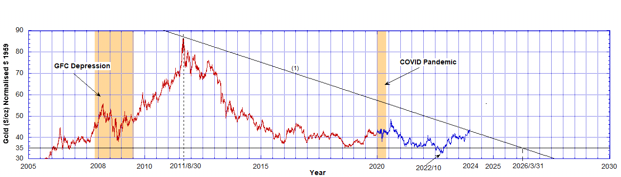 Chart 4: The price of an ounce of gold in 1959 dollars. These are the same data as Chart 3 but only data after 2005 are shown. The horizontal solid line is the $35 price of an ounce of gold from 1959. The descending solid straight line (1) touches the tips of the peaks and was derived in Chart 3. The sepia strips indicate recessions.
Here we have a picture of the gold price in 1959 dollars where blue data are the result of the 2020 QE4 credit expansion. The gold price met resistance along the straight line (1) (see Chart 3) in a descending triangle formation. After 2006, the price has remained above $35 except around October 2022.
What is most important is that as of the end of December 2023, it looks like the real price is about to break above line (1). This is the limit of the currently available data though. If this happens it would be the first time since 1980 this line has been broken through. That means the gold price has increased in real terms above the statutory $35 from where the inflationary era really kicked off.
Any value above the horizontal $35 line is an increase in real terms. But to break out above line (1) seems to mean breaking through some notional resistance and it signals more buyers entering the market.
If human action and technical analysis converge on the pattern of the descending triangle, then there would have to be some reflection of human nature in this pattern in order to credibly interpret a breakthrough as something significant at all. While the objection that this is reverse engineering is understandable, there are reasons to think that a triangle pattern is reflective of what is actually going on in the monetary sphere on a human action level.
A plausible way to look at the pattern as it concerns human action is as follows. As the inflationary machine expands, paper assets seem to increase in value as their dollar-denominated value expands. As this process continues, the increase in purchasing power tends to get stuck within those paper assets, while prices in the consumer sector and the gold price itself inflate at similar rates. Within the inflationary process, the central bank loses control at times and paper assets lose much of their previous purchasing power in a deflationary storm. This affects consumer prices as well as the gold price but much less, however.
As the central bank initially reinflates in order to regain control of the system, gold tends to increase the fastest together with consumer prices, which never really stopped increasing anyway. This is when gold’s real purchasing power in 1959 dollars rose the most. However, each reinflation affects gold less and less on a downward descending triangle, as asset prices regain their highs more and more quickly since the central bank has learned how to reverse the deflationary process faster and faster.
At some point though, faith in paper assets finally falls, and the next round of inflation pours most directly into consumer goods, drawing even more purchasing power from paper assets into consumer goods in a panic. A plausible mechanism as to what could cause this would be the breaking of the Treasury market through a failed auction, which would upset all paper asset values throughout the world. In that case, the real purchasing power of gold could easily spike through the descending triangle, which would signal that the central bank has finally lost control over where the inflation is funnelled. All previous rounds of inflation from the beginning of the period, beginning in 1971, would focus in on increasing gold’s real purchasing power in an effort to re-monetise gold and purge the inflation from the system entirely.
Are we on the verge of such a breakout?
If the Federal Reserve continues tightening into August 2024, it will have reached the same conditions of the 2019 Repocalypse, which could cause the break in the Treasury market referenced above. The 2020 Covid Pandemic was the solution to the Repocalypse back then by giving the Federal Reserve the excuse to print what was needed to inflate its way out of problems in the repo market.
If the Fed starts the presses again in 2024 causing greater price inflation, the price of gold in current dollars has to explode to keep the price in 1959 dollars within the triangle in Chart 4. But all indications are the markets will ignore them and the real price will explode above the resistance line (1) in Chart 4 as the price of gold breaks out of these restraints like it did in 1980. That means a price increase in real terms. The question is, how high does the real price of gold have to go to inspire global dollar rejection and re-monetisation of money itself?
Silver Remains Undervalued
Silver is more of a complicated issue because since 1873, the dollar has been (and we argue continues to be) a gold derivative exclusively. Therefore, much of silver’s monetary features have been in hibernation, so to speak, until such time as the public returns to silver out of necessity when the dollar is no longer a functioning gold derivative at all. In other words, when the dollar/gold exchange rate approaches infinity. At that point, silver will be necessary for retail transactions, as gold is too expensive for such trade without a derivative to divide it into retail fractional amounts.
Nevertheless, we apply the same methodology here on the assumption that, though silver’s monetary features are hidden, they do express themselves periodically when faith in the dollar as a viable gold derivative is in doubt by the public.
Regarding silver, we compare the prices of silver and gold in terms of their price in 1959 dollars. We also show that in terms of the 1959 dollar-denominated price for silver, it currently is extremely undervalued at half its 1959 value. We employ the same dollar deflation function based on the M2 currency supply from Chart 2. The following Chart 5 results.
Chart 4: The price of an ounce of gold in 1959 dollars. These are the same data as Chart 3 but only data after 2005 are shown. The horizontal solid line is the $35 price of an ounce of gold from 1959. The descending solid straight line (1) touches the tips of the peaks and was derived in Chart 3. The sepia strips indicate recessions.
Here we have a picture of the gold price in 1959 dollars where blue data are the result of the 2020 QE4 credit expansion. The gold price met resistance along the straight line (1) (see Chart 3) in a descending triangle formation. After 2006, the price has remained above $35 except around October 2022.
What is most important is that as of the end of December 2023, it looks like the real price is about to break above line (1). This is the limit of the currently available data though. If this happens it would be the first time since 1980 this line has been broken through. That means the gold price has increased in real terms above the statutory $35 from where the inflationary era really kicked off.
Any value above the horizontal $35 line is an increase in real terms. But to break out above line (1) seems to mean breaking through some notional resistance and it signals more buyers entering the market.
If human action and technical analysis converge on the pattern of the descending triangle, then there would have to be some reflection of human nature in this pattern in order to credibly interpret a breakthrough as something significant at all. While the objection that this is reverse engineering is understandable, there are reasons to think that a triangle pattern is reflective of what is actually going on in the monetary sphere on a human action level.
A plausible way to look at the pattern as it concerns human action is as follows. As the inflationary machine expands, paper assets seem to increase in value as their dollar-denominated value expands. As this process continues, the increase in purchasing power tends to get stuck within those paper assets, while prices in the consumer sector and the gold price itself inflate at similar rates. Within the inflationary process, the central bank loses control at times and paper assets lose much of their previous purchasing power in a deflationary storm. This affects consumer prices as well as the gold price but much less, however.
As the central bank initially reinflates in order to regain control of the system, gold tends to increase the fastest together with consumer prices, which never really stopped increasing anyway. This is when gold’s real purchasing power in 1959 dollars rose the most. However, each reinflation affects gold less and less on a downward descending triangle, as asset prices regain their highs more and more quickly since the central bank has learned how to reverse the deflationary process faster and faster.
At some point though, faith in paper assets finally falls, and the next round of inflation pours most directly into consumer goods, drawing even more purchasing power from paper assets into consumer goods in a panic. A plausible mechanism as to what could cause this would be the breaking of the Treasury market through a failed auction, which would upset all paper asset values throughout the world. In that case, the real purchasing power of gold could easily spike through the descending triangle, which would signal that the central bank has finally lost control over where the inflation is funnelled. All previous rounds of inflation from the beginning of the period, beginning in 1971, would focus in on increasing gold’s real purchasing power in an effort to re-monetise gold and purge the inflation from the system entirely.
Are we on the verge of such a breakout?
If the Federal Reserve continues tightening into August 2024, it will have reached the same conditions of the 2019 Repocalypse, which could cause the break in the Treasury market referenced above. The 2020 Covid Pandemic was the solution to the Repocalypse back then by giving the Federal Reserve the excuse to print what was needed to inflate its way out of problems in the repo market.
If the Fed starts the presses again in 2024 causing greater price inflation, the price of gold in current dollars has to explode to keep the price in 1959 dollars within the triangle in Chart 4. But all indications are the markets will ignore them and the real price will explode above the resistance line (1) in Chart 4 as the price of gold breaks out of these restraints like it did in 1980. That means a price increase in real terms. The question is, how high does the real price of gold have to go to inspire global dollar rejection and re-monetisation of money itself?
Silver Remains Undervalued
Silver is more of a complicated issue because since 1873, the dollar has been (and we argue continues to be) a gold derivative exclusively. Therefore, much of silver’s monetary features have been in hibernation, so to speak, until such time as the public returns to silver out of necessity when the dollar is no longer a functioning gold derivative at all. In other words, when the dollar/gold exchange rate approaches infinity. At that point, silver will be necessary for retail transactions, as gold is too expensive for such trade without a derivative to divide it into retail fractional amounts.
Nevertheless, we apply the same methodology here on the assumption that, though silver’s monetary features are hidden, they do express themselves periodically when faith in the dollar as a viable gold derivative is in doubt by the public.
Regarding silver, we compare the prices of silver and gold in terms of their price in 1959 dollars. We also show that in terms of the 1959 dollar-denominated price for silver, it currently is extremely undervalued at half its 1959 value. We employ the same dollar deflation function based on the M2 currency supply from Chart 2. The following Chart 5 results.
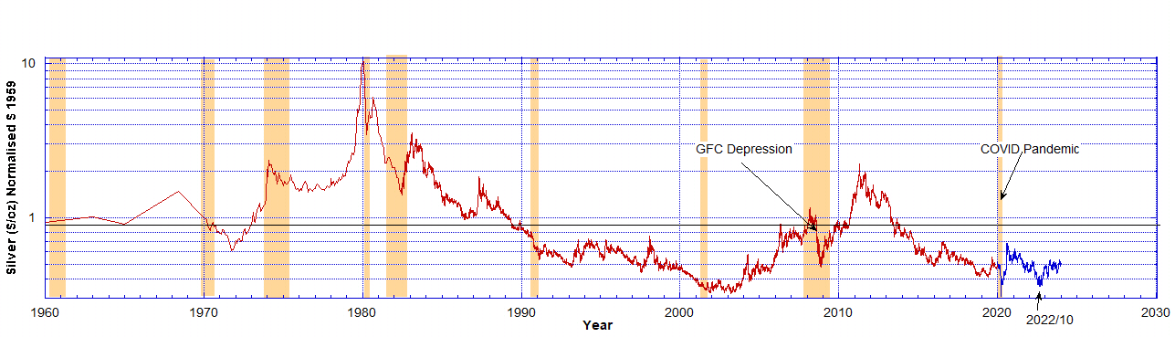 Chart 5: The price of an ounce of silver in 1959 dollars on a log-linear axes. The red data are the price of silver ($/oz) scaled by the USD normalisation curve from Chart 2 using curve (1) and the blue data are scaled using curve (2). The historical silver price data were downloaded from CalcProfi and the National Mining Association. The horizontal solid line is the $0.9 price for an ounce of silver from 1959. The sepia strips indicate recessions.
Using normalised 1959 dollars, we have plotted in Chart 5 the normalised price of silver as a function of time (years) from 1959 to December 2023. The red and blue colours indicate the period the data are taken from and the normalisation curve used from Chart 2. The very fact that the resulting silver price is constant in broad terms over the 65 years of data used illustrates that the price inflation is derived from the expansion of the M2 credit supply. See Chart 6 below, which uses linear axes.
The price of silver in 1959 started at $0.90. The horizontal solid line indicates this level. Now that all dollars are 1959 dollars we can see the real price of silver over the past 65 years. Any time it dipped below 90 cents it was undervalued in real terms. Any time it was above that line it was higher in real value. Since 1990 it has been undervalued up until the present except between July 2010 and November 2013. Note the drop in the real price (in 1959 $ terms) of silver during recessions. Particularly note the price drops during the 2008 GFC Depression and the 2020 Covid Pandemic.
Chart 5: The price of an ounce of silver in 1959 dollars on a log-linear axes. The red data are the price of silver ($/oz) scaled by the USD normalisation curve from Chart 2 using curve (1) and the blue data are scaled using curve (2). The historical silver price data were downloaded from CalcProfi and the National Mining Association. The horizontal solid line is the $0.9 price for an ounce of silver from 1959. The sepia strips indicate recessions.
Using normalised 1959 dollars, we have plotted in Chart 5 the normalised price of silver as a function of time (years) from 1959 to December 2023. The red and blue colours indicate the period the data are taken from and the normalisation curve used from Chart 2. The very fact that the resulting silver price is constant in broad terms over the 65 years of data used illustrates that the price inflation is derived from the expansion of the M2 credit supply. See Chart 6 below, which uses linear axes.
The price of silver in 1959 started at $0.90. The horizontal solid line indicates this level. Now that all dollars are 1959 dollars we can see the real price of silver over the past 65 years. Any time it dipped below 90 cents it was undervalued in real terms. Any time it was above that line it was higher in real value. Since 1990 it has been undervalued up until the present except between July 2010 and November 2013. Note the drop in the real price (in 1959 $ terms) of silver during recessions. Particularly note the price drops during the 2008 GFC Depression and the 2020 Covid Pandemic.
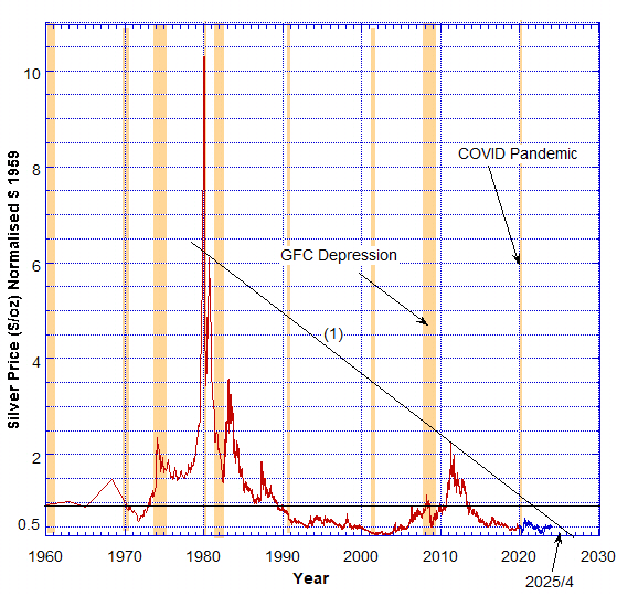 Chart 6: The price of an ounce of silver in 1959 dollars on linear axes. This is the same data from Chart 5 except a linear vertical axis is used. The red data are the price of silver ($/oz) scaled by the USD normalisation curve (1) and the blue data are scaled using curve (2) from Chart 2. The horizontal solid line is the $0.9 price for an ounce of silver from 1959. The sepia strips indicate recessions.
Using similar technical analysis to the gold price in Charts 3 and 4 we have drawn the descending straight line (1) which meets the $0.50 price level in April 2025 and meets the bottom axis in June 2026 which is about the same time the gold price apex occurs. If gold does indeed break out through its own triangle, meaning if the real purchasing power of gold as measured through 1959 dollars increases significantly, we can infer from this that trust in the dollar as a viable gold derivative is breaking down, and consequently, silver would head towards the historic monetary ratio of around 15:1 as the dollar becomes less and less usable for retail transactions.
In the following Chart 7 we compare the gold and silver prices. The best way to do is to convert the data on the price of silver from Chart 5 and 6 to the equivalent price of gold and display them on the same plot. The conversion factor used is the ratio of the gold to silver price in 1959, equal to 35/0.9 = 38.9.
Chart 6: The price of an ounce of silver in 1959 dollars on linear axes. This is the same data from Chart 5 except a linear vertical axis is used. The red data are the price of silver ($/oz) scaled by the USD normalisation curve (1) and the blue data are scaled using curve (2) from Chart 2. The horizontal solid line is the $0.9 price for an ounce of silver from 1959. The sepia strips indicate recessions.
Using similar technical analysis to the gold price in Charts 3 and 4 we have drawn the descending straight line (1) which meets the $0.50 price level in April 2025 and meets the bottom axis in June 2026 which is about the same time the gold price apex occurs. If gold does indeed break out through its own triangle, meaning if the real purchasing power of gold as measured through 1959 dollars increases significantly, we can infer from this that trust in the dollar as a viable gold derivative is breaking down, and consequently, silver would head towards the historic monetary ratio of around 15:1 as the dollar becomes less and less usable for retail transactions.
In the following Chart 7 we compare the gold and silver prices. The best way to do is to convert the data on the price of silver from Chart 5 and 6 to the equivalent price of gold and display them on the same plot. The conversion factor used is the ratio of the gold to silver price in 1959, equal to 35/0.9 = 38.9.
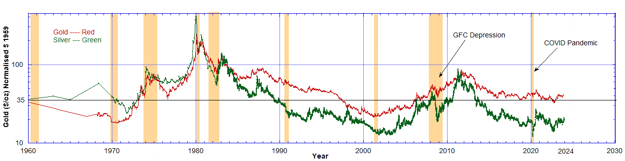 Chart 7: The price of an ounce of gold (red) and an ounce of silver (green) in 1959 dollars on Log-Linear axes. The gold price ($/oz) axis is logarithmic and the time (year) axis is linear. The solid horizontal line is the $35 price of an ounce of gold from 1959. The silver price has been converted to an equivalent gold price by the factor 35/0.9 = 38.9. Between 1959 and 1970 the data are sparse.
From Chart 7 it is apparent that while gold has retained its real value (its current price is above the $35 line) silver has not. Silver is very undervalued, compared to gold by a factor of 50 per cent, using the same measure of 1959 dollars as a standard. This is consistent with the fact that much of silver’s ‘moneyness’ has been submerged since 1873 when the dollar went off a bimetallic standard. The monetary features of silver only periodically resurface in times of monetary panic, particularly in 1919, 1968, and 1980. Note the peaks in 1968 and 1980.
From 1970 to 1984, during times of acute monetary stress, silver maintained an equivalent price with gold. In fact, at times it was valued higher than gold during that period. Since 1984 silver has been significantly undervalued compared to gold.
Chart 7: The price of an ounce of gold (red) and an ounce of silver (green) in 1959 dollars on Log-Linear axes. The gold price ($/oz) axis is logarithmic and the time (year) axis is linear. The solid horizontal line is the $35 price of an ounce of gold from 1959. The silver price has been converted to an equivalent gold price by the factor 35/0.9 = 38.9. Between 1959 and 1970 the data are sparse.
From Chart 7 it is apparent that while gold has retained its real value (its current price is above the $35 line) silver has not. Silver is very undervalued, compared to gold by a factor of 50 per cent, using the same measure of 1959 dollars as a standard. This is consistent with the fact that much of silver’s ‘moneyness’ has been submerged since 1873 when the dollar went off a bimetallic standard. The monetary features of silver only periodically resurface in times of monetary panic, particularly in 1919, 1968, and 1980. Note the peaks in 1968 and 1980.
From 1970 to 1984, during times of acute monetary stress, silver maintained an equivalent price with gold. In fact, at times it was valued higher than gold during that period. Since 1984 silver has been significantly undervalued compared to gold.
Chart 1: The red data are the M2 currency supply data for 1959–2023 from the Board of Governors of the Federal Reserve System, statistical release H.6. Money Stock Measures, via FRED. The dashed curve (1) is an exponential fit to the data between 1959 and 2020. The dashed curve (2) is a 5th-order polynomial fit to the data after 2020 up to December 2023. After normalisation, the M2 supply becomes essentially constant (not shown). Sepia strips indicate recessions.
From Chart 1, we used the exponential fit curve, the dashed line (1), to normalise US dollars to 1959 dollars, up to 2020. $1 in 1959 inflates according to the exponential red curve (1) in Chart 2. Because the M2 currency supply after 2020 departs strongly from the exponential in Chart 1 we have piece-wise separately modelled the M2 money supply between 2020 and 2024 using the blue polynomial curve (2). This is to compensate for the absolutely unprecedented additional currency flooded into the market from the Covid period. Due to QT in 2023 curve (2) is now approaching the theoretical value of curve (1) in late 2023.
Chart 2: $1 in 1959 will deflate by the exponential (red) curve followed by the blue curve (2) as shown. This is the price inflation of 1/35 oz of gold over this time period resulting only from the expansion of the M2 currency supply. Thus the gold price is inflated by a factor of 47 by the end of 2023 in terms of current dollars. This means that the USD has lost about 98 per cent of its value in the last 65 years. If the price of gold remains constant in terms of 1959 dollars then its current price is only rising due to inflation. However, after 2020 the anomalous curve (2) had to be used to allow for the massive additional deflation of the dollar’s value in that period.
Using the curves (1) + (2) for normalised 1959 dollars, from Chart 2, we have plotted in Chart 3 the normalised price of gold as a function of time in years from 1959 to December 2023. By dividing the price of an ounce of gold by the dollar inflation factor from Chart 2, we get the price of an ounce of gold in 1959 dollars. As a result, we have the price of gold over 65 years priced in 1959 dollars. The colour-coding for the red and blue data is merely maintained to show the respective periods where either the red curve (1) or the blue curve (2) has been used to calculate the gold price in 1959 dollars.
Chart 3: The price of an ounce of gold in 1959 dollars. The red data are the price of gold ($/oz) scaled by the USD normalisation curve from Chart 2 using curve (1) and the blue data are scaled using curve (2). The historical gold price data were downloaded from Auronum, the National Mining Association and YCharts. The horizontal solid line is the $35 price for an ounce of gold from 1959. The descending solid straight line (1) touches the tips of the peaks except in 1980 where a few points break above it. The bottom ascending solid line, in two places, touches the minimal gold price and also coincides with the same apex point in 2026. The sepia strips indicate recessions.
Before 1970, we were on the gold standard and the price of gold was essentially constant while currency was being created. Therefore, using 1959 dollars we notice the price of gold was falling in real terms, despite rising slightly in inflated dollar terms. No wonder the US government had to close the gold window, as foreign central banks were taking advantage of the low gold price and getting rid of dollars.
After 1971, President Nixon uncoupled the dollar from a fixed amount of gold and thus the real price of gold, in 1959 dollar terms, began to rise very significantly until it peaked in 1980. There was a brief period when it dipped back and nearly touched the $35 price in August 1976 but exploded upward after that.
Because Charts 3 and 4 use dollars of constant gold value (1/35 oz of gold in 1959) we can compare the ‘real’ gold price, which could be seen as its purchasing power, over these decades. Generally, one can observe a fall in the real gold price during any recession as indicated in the sepia strips.
By June 1997 the gold price fell back to $35 (1959 dollars), dropped below $35 and stayed below it until January 2006. That was a good time to buy gold, as it was cheap. It peaked again by August 2011 and around October 2022 dropped below $35 for 2 months but now appears to be converging on an apex point of $35 in 2026. The price rally peaks have been diminishing as a function of time.
We can see recent features more clearly if we look at the same data but from 2005 onwards, as shown in Chart 4.
Chart 4: The price of an ounce of gold in 1959 dollars. These are the same data as Chart 3 but only data after 2005 are shown. The horizontal solid line is the $35 price of an ounce of gold from 1959. The descending solid straight line (1) touches the tips of the peaks and was derived in Chart 3. The sepia strips indicate recessions.
Here we have a picture of the gold price in 1959 dollars where blue data are the result of the 2020 QE4 credit expansion. The gold price met resistance along the straight line (1) (see Chart 3) in a descending triangle formation. After 2006, the price has remained above $35 except around October 2022.
What is most important is that as of the end of December 2023, it looks like the real price is about to break above line (1). This is the limit of the currently available data though. If this happens it would be the first time since 1980 this line has been broken through. That means the gold price has increased in real terms above the statutory $35 from where the inflationary era really kicked off.
Any value above the horizontal $35 line is an increase in real terms. But to break out above line (1) seems to mean breaking through some notional resistance and it signals more buyers entering the market.
If human action and technical analysis converge on the pattern of the descending triangle, then there would have to be some reflection of human nature in this pattern in order to credibly interpret a breakthrough as something significant at all. While the objection that this is reverse engineering is understandable, there are reasons to think that a triangle pattern is reflective of what is actually going on in the monetary sphere on a human action level.
A plausible way to look at the pattern as it concerns human action is as follows. As the inflationary machine expands, paper assets seem to increase in value as their dollar-denominated value expands. As this process continues, the increase in purchasing power tends to get stuck within those paper assets, while prices in the consumer sector and the gold price itself inflate at similar rates. Within the inflationary process, the central bank loses control at times and paper assets lose much of their previous purchasing power in a deflationary storm. This affects consumer prices as well as the gold price but much less, however.
As the central bank initially reinflates in order to regain control of the system, gold tends to increase the fastest together with consumer prices, which never really stopped increasing anyway. This is when gold’s real purchasing power in 1959 dollars rose the most. However, each reinflation affects gold less and less on a downward descending triangle, as asset prices regain their highs more and more quickly since the central bank has learned how to reverse the deflationary process faster and faster.
At some point though, faith in paper assets finally falls, and the next round of inflation pours most directly into consumer goods, drawing even more purchasing power from paper assets into consumer goods in a panic. A plausible mechanism as to what could cause this would be the breaking of the Treasury market through a failed auction, which would upset all paper asset values throughout the world. In that case, the real purchasing power of gold could easily spike through the descending triangle, which would signal that the central bank has finally lost control over where the inflation is funnelled. All previous rounds of inflation from the beginning of the period, beginning in 1971, would focus in on increasing gold’s real purchasing power in an effort to re-monetise gold and purge the inflation from the system entirely.
Are we on the verge of such a breakout?
If the Federal Reserve continues tightening into August 2024, it will have reached the same conditions of the 2019 Repocalypse, which could cause the break in the Treasury market referenced above. The 2020 Covid Pandemic was the solution to the Repocalypse back then by giving the Federal Reserve the excuse to print what was needed to inflate its way out of problems in the repo market.
If the Fed starts the presses again in 2024 causing greater price inflation, the price of gold in current dollars has to explode to keep the price in 1959 dollars within the triangle in Chart 4. But all indications are the markets will ignore them and the real price will explode above the resistance line (1) in Chart 4 as the price of gold breaks out of these restraints like it did in 1980. That means a price increase in real terms. The question is, how high does the real price of gold have to go to inspire global dollar rejection and re-monetisation of money itself?
Silver Remains Undervalued
Silver is more of a complicated issue because since 1873, the dollar has been (and we argue continues to be) a gold derivative exclusively. Therefore, much of silver’s monetary features have been in hibernation, so to speak, until such time as the public returns to silver out of necessity when the dollar is no longer a functioning gold derivative at all. In other words, when the dollar/gold exchange rate approaches infinity. At that point, silver will be necessary for retail transactions, as gold is too expensive for such trade without a derivative to divide it into retail fractional amounts.
Nevertheless, we apply the same methodology here on the assumption that, though silver’s monetary features are hidden, they do express themselves periodically when faith in the dollar as a viable gold derivative is in doubt by the public.
Regarding silver, we compare the prices of silver and gold in terms of their price in 1959 dollars. We also show that in terms of the 1959 dollar-denominated price for silver, it currently is extremely undervalued at half its 1959 value. We employ the same dollar deflation function based on the M2 currency supply from Chart 2. The following Chart 5 results.
Chart 5: The price of an ounce of silver in 1959 dollars on a log-linear axes. The red data are the price of silver ($/oz) scaled by the USD normalisation curve from Chart 2 using curve (1) and the blue data are scaled using curve (2). The historical silver price data were downloaded from CalcProfi and the National Mining Association. The horizontal solid line is the $0.9 price for an ounce of silver from 1959. The sepia strips indicate recessions.
Using normalised 1959 dollars, we have plotted in Chart 5 the normalised price of silver as a function of time (years) from 1959 to December 2023. The red and blue colours indicate the period the data are taken from and the normalisation curve used from Chart 2. The very fact that the resulting silver price is constant in broad terms over the 65 years of data used illustrates that the price inflation is derived from the expansion of the M2 credit supply. See Chart 6 below, which uses linear axes.
The price of silver in 1959 started at $0.90. The horizontal solid line indicates this level. Now that all dollars are 1959 dollars we can see the real price of silver over the past 65 years. Any time it dipped below 90 cents it was undervalued in real terms. Any time it was above that line it was higher in real value. Since 1990 it has been undervalued up until the present except between July 2010 and November 2013. Note the drop in the real price (in 1959 $ terms) of silver during recessions. Particularly note the price drops during the 2008 GFC Depression and the 2020 Covid Pandemic.
Chart 6: The price of an ounce of silver in 1959 dollars on linear axes. This is the same data from Chart 5 except a linear vertical axis is used. The red data are the price of silver ($/oz) scaled by the USD normalisation curve (1) and the blue data are scaled using curve (2) from Chart 2. The horizontal solid line is the $0.9 price for an ounce of silver from 1959. The sepia strips indicate recessions.
Using similar technical analysis to the gold price in Charts 3 and 4 we have drawn the descending straight line (1) which meets the $0.50 price level in April 2025 and meets the bottom axis in June 2026 which is about the same time the gold price apex occurs. If gold does indeed break out through its own triangle, meaning if the real purchasing power of gold as measured through 1959 dollars increases significantly, we can infer from this that trust in the dollar as a viable gold derivative is breaking down, and consequently, silver would head towards the historic monetary ratio of around 15:1 as the dollar becomes less and less usable for retail transactions.
In the following Chart 7 we compare the gold and silver prices. The best way to do is to convert the data on the price of silver from Chart 5 and 6 to the equivalent price of gold and display them on the same plot. The conversion factor used is the ratio of the gold to silver price in 1959, equal to 35/0.9 = 38.9.
Chart 7: The price of an ounce of gold (red) and an ounce of silver (green) in 1959 dollars on Log-Linear axes. The gold price ($/oz) axis is logarithmic and the time (year) axis is linear. The solid horizontal line is the $35 price of an ounce of gold from 1959. The silver price has been converted to an equivalent gold price by the factor 35/0.9 = 38.9. Between 1959 and 1970 the data are sparse.
From Chart 7 it is apparent that while gold has retained its real value (its current price is above the $35 line) silver has not. Silver is very undervalued, compared to gold by a factor of 50 per cent, using the same measure of 1959 dollars as a standard. This is consistent with the fact that much of silver’s ‘moneyness’ has been submerged since 1873 when the dollar went off a bimetallic standard. The monetary features of silver only periodically resurface in times of monetary panic, particularly in 1919, 1968, and 1980. Note the peaks in 1968 and 1980.
From 1970 to 1984, during times of acute monetary stress, silver maintained an equivalent price with gold. In fact, at times it was valued higher than gold during that period. Since 1984 silver has been significantly undervalued compared to gold.