In my article in The Spectator Australia on Tuesday on discrepancies between models that predicted a reduction and data that showed a surge in coronavirus cases following the rollout of vaccines, I noted the reality of the decoupling between numbers and severity of infections following vaccination. This would likely reduce Covid-related hospitalisations and deaths.
In response, a reader suggested I look at the pre and post-vaccination mortality data from the European Union. Many readers in Australia and other Western countries might not be all that impressed by the examples of Bhutan, Seychelles, India and Malta because of dodgy data or small numbers, but will find it far more challenging to question the reliability of the data from the EU, he wrote.
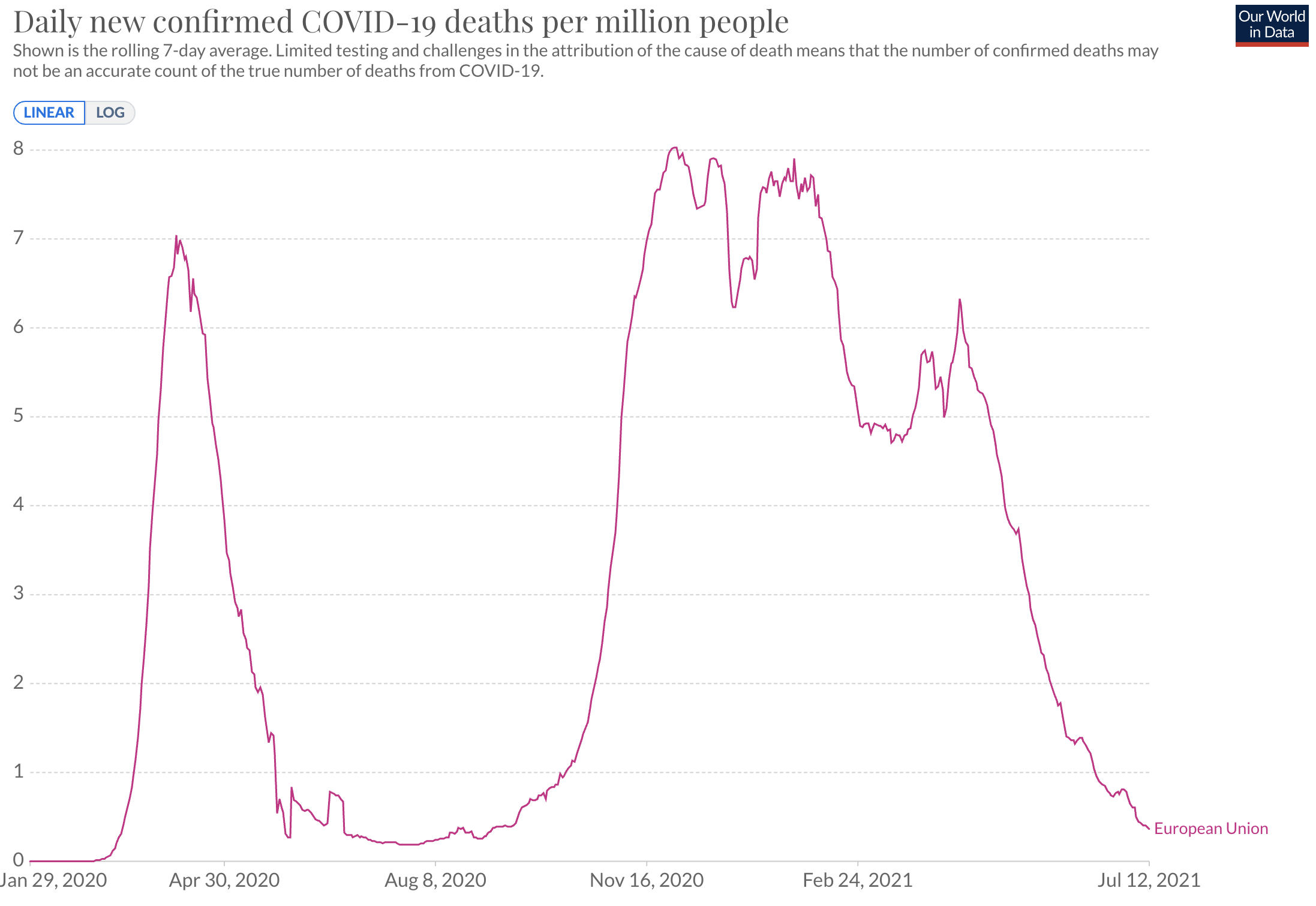
He has a point. The EU’s vaccination campaign began on 16 December. By 16 June 2021, 46% of people had received at least one dose of the Covid vaccine and 26% were fully vaccinated. As this extremely informative chart shows, the EU’s total number of Covid deaths in the 6 months before vaccinations began was 193,346, during which period the cumulative deaths per million people increased from 292 to 727. The total number of Covid deaths in the 6 months after vaccination rose steeply to 411,315 and the deaths per million increased from 727 to 1,651.
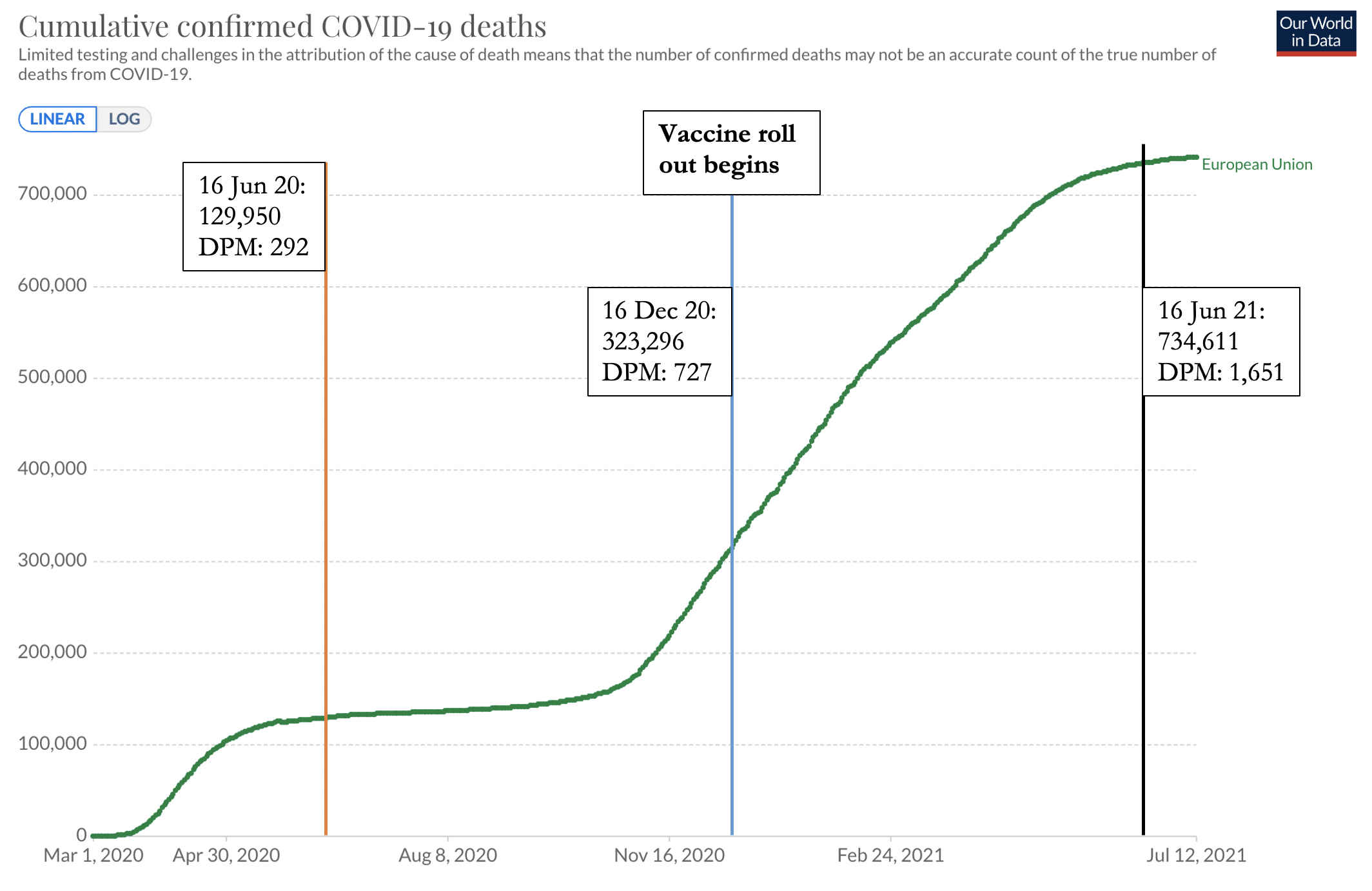
Source: Our World in Data
In other words, the total number of Covid-19 related deaths more than doubled in the six months following vaccination compared to the six months before vaccination in the European Union. Has anyone offered a convincing, or even a plausible explanation? To be fair, the 7-day rolling average of daily new deaths per million people was 0.59 on 6 June 2020, 7.82 on 6 December, and 1.37 on 6 June 2021, respectively. The steep decline began on 13 April, was down to 0.36 on 12 July, and has not yet changed direction again. So it is entirely possible that the good that vaccines do will show through in the total mortality statistics from now on, several months after the campaign got under way.
However, a nagging suspicion remains that the epidemiological and public health experts still have not got on top of the virus and are making it up as they go along, wanting to appear tough and decisive. No one really seems to know why, where, when, and with how much ferocity the virus, and its always mutating variants, will return. A new wave seems to surge, crest, crash and retreat spent and exhausted. In no country has it continued to grow exponentially forever, which is why ‘Do the maths’ glib comment was always fatuous and science-illiterate.
If we look back at the EU chart for daily deaths per million people from the start of the pandemic to the first wave, the downward slope that inevitably follows is almost always equally steep, regardless of what measures are in place and not in place. In addition, variants are often more infectious but far less virulent. The so-called ‘harvesting’ effect, which kills off the pool of the most vulnerable cohorts in the initial waves, also helps to break the link between infections and hospitalisation, ICU admissions and deaths.
In sum, the true measure of the effectiveness of vaccines will not be known until after the 2021–2022 ‘flu’ season.