One Sunday evening in the autumn of 1888 Vincent van Gogh and Paul Gauguin went for a walk. They headed out of Arles into the countryside and when they looked back towards town they saw a sunset so splendid that each was inspired to paint a masterpiece. One of these, Gauguin’s painting bearing the timely title ‘Human Misery’, is among the star exhibits in a new exhibition at the Royal Academy.
All the works in this show come from a delightful small museum in the northern suburbs of Copenhagen, housed in the early 20th-century mansion from which it takes its name, Ordrupgaard. This was the dwelling of Wilhelm Hansen (1868–1936), a mover-and-shaker in the Danish life insurance business and an avid collector of what was then modern art.
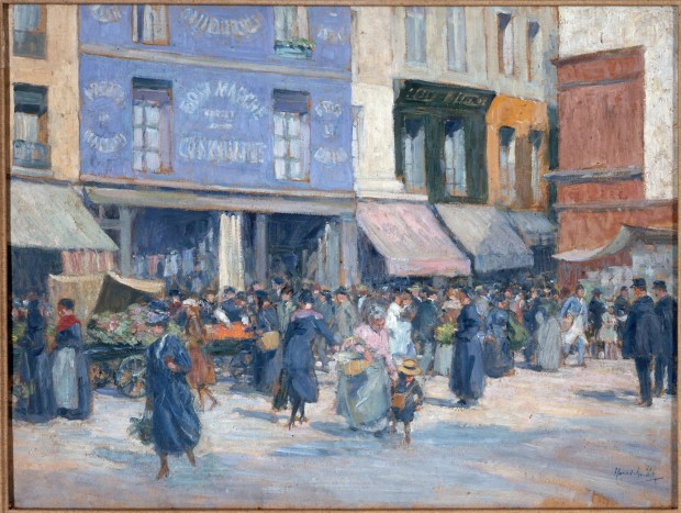
The title Gauguin and the Impressionistsnotwithstanding, this show is a mixed bag of 19th-century French paintings, which are by no means all impressionist. Of course, it’s easy to understand why the RA emphasised that aspect of the exhibition. Impressionism is notoriously attractive to the public, and correspondingly can seem excessively easy on the eye — ‘chocolate box’ — to sophisticates. But that appearance is misleading. To contemporaries, not only would the brushwork of their pictures have seemed outrageously loose, but many of the subjects would have seemed abrasively utilitarian. Pissarro’s street scenes from the 1890s are typical in representing crowds and traffic in what were then thoroughly unpicturesque new shopping districts of Paris.
In a way, pictures such as these succeeded all too well. Monet’s ‘Waterloo Bridge, Overcast’ (1903) is a perfect case in point. This depicts a heavily polluted Thames on a day so gloomy that the lighted buses are glowing like coals. Most of those trudging over that bridge would have thought the scene dreary, if they noticed it at all. Of course, Monet loved the hazy, smoke-filled air and the filthy water of the river, which shimmers like pewter. But he wasn’t
prettifying; he was finding beauty where almost no one else could see it.
French painters of the mid 19th century — the generations who came before the impressionists — do not suffer from overpopularity; on the contrary, several are badly neglected, especially in this country. But Hansen accumulated some corkers from this period, three fine Courbets among them, including one of Étretat that is the opposite of a Monet seascape. The latter emphasised the surface reflections on the water, the former its depth and weight.
Delacroix’s painting of the writer Georges Sand is superbly graceful and intense. This turns out to be a study of her romantically absorbed in music, listening to her lover Chopin playing the piano. Unfortunately, someone cut the original picture in half — a dealer perhaps — and the portrait of the composer is now in the Louvre.
Hansen also collected what was then more recent painting, though one senses he did so a little more cautiously. The third part of the exhibition contains one marvellous painting each by Cézanne and Matisse. As you look at the former, a group of naked bathers in a blue-green grove from 1895, you seem to see the new world of 20th-century art, from cubism to abstraction, emerging into view.
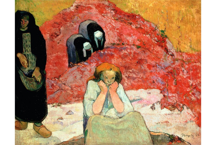
Hansen evidently went for Gauguin in a big way; there are eight on show at the RA. But he also seems to have been wary of the tropical colour of the artist’s Polynesian period. ‘Tahitian Woman’ (1898) is disappointingly dull, even muddy. The finest of Hansen’s Gauguins are early; most exciting of all is the picture that he painted after seeing that sunset in Arles.
This is far from being a straightforward landscape; more a vague allegory like his later masterpiece, ‘Where do we come from?’. He gave this one various titles — ‘Wine Harvest’, ‘Poverty’ and lastly ‘Human Misery’. It includes a brooding figure seated in the foreground, and various women wearing Breton dress even though the scene was in the south of France (he had previously been working in Brittany). ‘So much,’ Gauguin boasted, ‘for exactitude.’
Van Gogh, the first critic to view ‘Human Misery’, thought it ‘very fine and very strange’. He was right both times, but more than the elusive meaning of this image, I was struck by the paintwork — free, splattered, almost abstract-expressionist, in the purple mound of vines.
This picture reveals a direct response to the heightened colour and bold impasto of Van Gogh’s new work, which Gauguin had seen when he arrived in Arles a week or two earlier (it must have been a shock; there were six Van Goghs in his bedroom alone, including two Sunflowers). Here he was obviously trying something similar, but in his own way.
This sort of thing — the actual paint surface, what the French call the matière — is just what you can’t see properly in a photograph or a virtual image. It’s a pleasure to be back looking at real pictures again.
Got something to add? Join the discussion and comment below.
You might disagree with half of it, but you’ll enjoy reading all of it. Try your first month for free, then just $2 a week for the remainder of your first year.