Viewers have different relationships with small pictures, or perhaps it’s the other way round: small pictures have different relationships with them. A big picture clamours for attention; a small picture you have to lean in to hear.
No picture is more intimate than a drawing, and none brings you closer to the artist’s hand. A drawing can’t lie; it wears its facture on its sleeve. If you look closely, you can work out how it was made and even track the artist’s changes of direction. You can see, for instance, how Van Gogh launched into ‘The Fortifications of Paris with Houses’ (1887) in watercolour, then fortified the fortifications with gouache and chalk. A graphic artist by nature, he was at sea with watercolour washes. The thesis of this once-in-a-lifetime show of 77 drawings – 46 from private collections and more than half never shown before in London – is that modern drawing began with the impressionists. Before impressionism, there were preliminary sketches and presentation drawings; after, there were all shades in between.
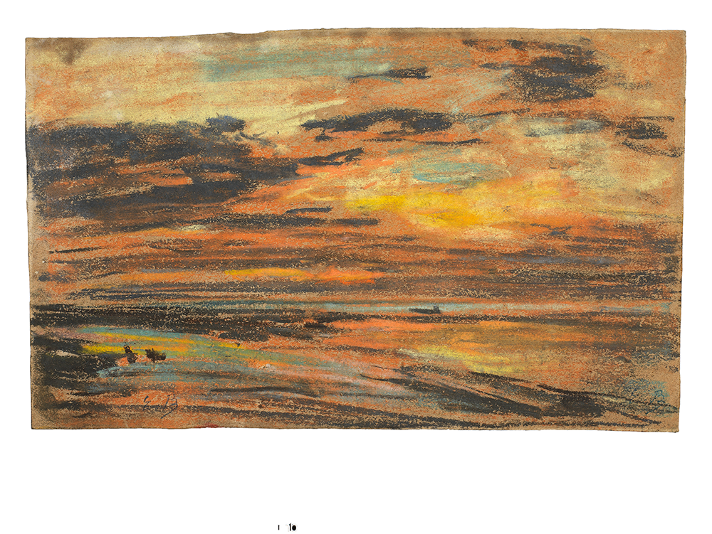 ‘Sunset over the Sea’, c. 1860-70, by Eugène Boudin. Photo: © Fitzwilliam Museum, Cambridge
What you leave out of a drawing is as important as what you put in
At the Paris Salon, drawings were treated as minor works and relegated to separate sections, but the impressionists hung everything together. They set no value on ‘finish’ for its own sake: if you got the essence of the subject down, it was job done. Drawing needn’t be a fag; it could be fun. It could also be experimental. The drawing revolution coincided with a parallel revolution in art materials: the development of light and versatile modern drawing media enabling artists to capture the moment faster than was possible at the time with cumbersome cameras. Portability was of the essence. Trying to capture a moment on a large canvas is a faff. Monet had to recruit local urchins to lug his oil painting gear down the cliffs at Étretat, but the pastel drawing on show here of ‘Cliffs at Étretat: The Needle Rock and Porte D’Aval’ (c.1885) he could slip into his pocket.
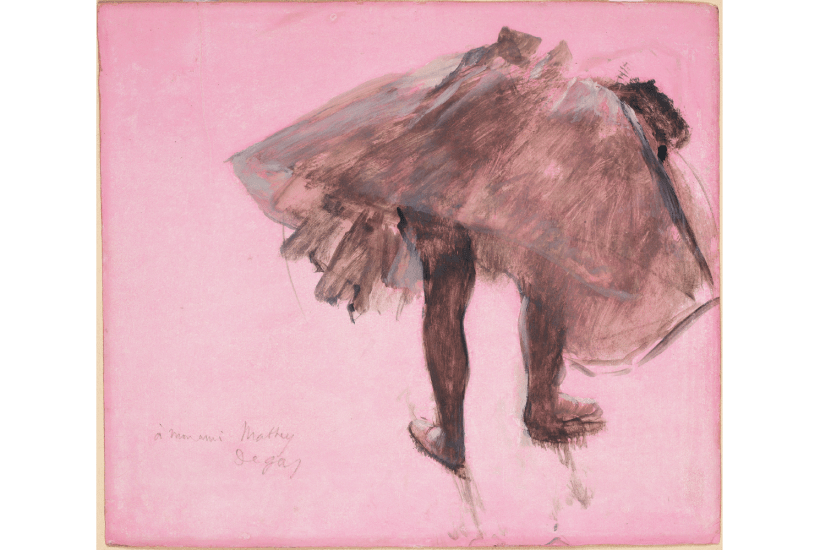
The revival of interest in pastel played a key role in raising the status of drawing. A medium that had fallen out of favour when the ‘pastel shades’ of the 18th-century French masters Chardin and de la Tour started looking too polite for modern tastes gained a new lease of life with the release on to the market of a dazzling range of artificial aniline colours. Degas embraced their vibrancy with enthusiasm, overlaying clashing shades in thickets of strokes without smudging or ‘sweetening’– he ‘understood the marriage and adultery of colours’, said the critic Joris-Karl Huysmans. He even dared to explore the new aniline-dyed papers: the viridian background to his ‘Dancer Yawning’ (1873) is so bright it’s a wonder it didn’t wake her up.
Monet’s painterly touch with pastel was smudgier – more traditional, surprisingly, than the stripes of pink and purple cloud streaking the trippy sky in his old teacher Boudin’s ‘Sunset over the Sea’ (c.1860-70). Seurat, who you might have expected to take to the new pastels like a duck to water, stuck to black Conté crayon on pimply paper in his study for the seated youth, ‘Bathers at Asnières’ (1884). He acquired his taste for funereal ‘fusain’ from Odilon Redon, whose professed terror of blank sheets of paper only seems to have impelled him to blacken them with dark imaginings during his ‘noir’ period. But even Redon was won over by the new pastels. The luminous ‘Stained Glass Window’ (1904), with its mysterious winged figure nursing a skull in the foreground shadows, marks a midway point on his chromatic journey towards the radiant ‘Ophelia among the Flowers’ (c.1905-08), by which time he was firmly ‘wedded to colour’ (see below).
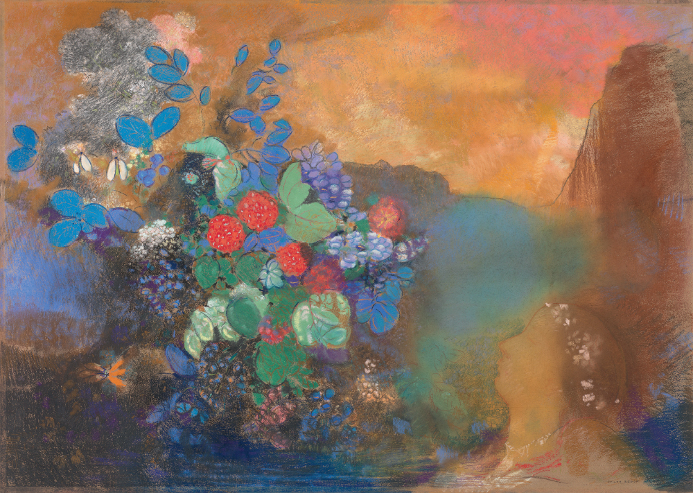 ‘Ophelia Among the Flowers’, c. 1905-08, by Odilon Redon. © The National Gallery, London
Although more of a symbolist than an impressionist, Redon shares the show’s climactic final room with Degas, Lautrec and Cézanne. Lautrec, like Degas, liked to leech the colour out of oil paint and thin it with turps to create the fluid matt medium called ‘essence’, which he used on cardboard for his sassy ‘Woman with a Black Boa’ (1892), captured mid-sashay.
The English watercolour tradition was sneered at by the French. Pissarro warned his son Lucien to ‘steer clear of those pretty English watercolours, so skilful and alas so weak’, and proposed an impressionist alternative in his shimmering, heat-hazy ‘Study of the Orchard of the Artist’s House at Eragny-sur-Epte’ (c.1890). Cézanne followed his example and took the shimmer further – you can see how far in two paintings of the same subject separated by some 20 years. In ‘Flowerpots’ (c.1885) the terracotta has solidity and the geranium leaves have substance; in ‘Flowerpots on the Terrace of the Artist’s Studio at Les Lauves’ (c.1902-06) the terracotta seems to be going up in smoke, emitting flickering flames of translucent greenery in gossamer-thin colour. The final lesson of this masterclass of an exhibition is that what you leave out of a drawing is as important as what you put in.
Got something to add? Join the discussion and comment below.
You might disagree with half of it, but you’ll enjoy reading all of it. Try your first month for free, then just $2 a week for the remainder of your first year.