Generally, stakeholder consultation is a good thing to do; regular rapport being a great lubricant for productive relations between any entity and its audiences. One unofficial phase of stakeholder engagement is sometimes called ‘flying a kite’, where an idea is provisionally floated or leaked – without too much contextual briefing – to gauge broad appetite for and feelings towards a concept under consideration. And so it appears with Essendon FC, as whispers emerged the club was pondering a branding review and the removal of the somehow controversial bomber-plane element of its logo.
When any business behind a ‘lovemark’ contemplates changing the elements that make up brand assets (colours, fonts, graphics etc) – due to cultural or commercial pressure – they need to consider the possibility of fierce resistance from brand loyalists. Sports fans can be irrationally wedded to the badges and merchandise they emotionally and financially invest in, meaning there are some firm no-nos to consider when changing logos.
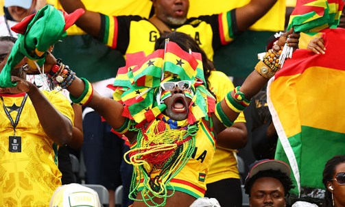
Many modern sports teams have been compelled to change or retire their former brand identities and nicknames. Activist groups, leery sponsors, and special interests can decree that certain assets and iconography are inappropriate for our enlightened times. In the US, sports franchises and teams properly bowed to pressures to drop racially insensitive names such as the Redmen, Redskins, and the Savages; a few others still cling to their Brave and Chief identifiers. The UK heard calls for both Manchester soccer teams to drop the ship graphics from their club badges due to the city’s linkage to the colonial slave trade (despite neither of the clubs even existing in those ignorant and insensitive times). Conversely, one US grid-iron team – the St. Bonaventure University Brown Squaws – was all too happy to relinquish its old ‘Squaws’ name supposedly after a Senaca chief pointed out the name means ‘vagina’ in the local indigenous tongue. Over in Guinea-Bissaua, FC Cuntum’s merchandise store would surely raise the hackles of any well-meaning Wokeist.
More seriously, though, are sports logos just the latest totems to be torn down like those decried colonial and imperial statues?
Essendon FC’s attempt to fly a kite over changing its brand ID was as short-lived as the notorious Messerschmitt Me-163 Komet, which had an alarming fuel fly time of around three minutes. The club’s ‘bombers’ nickname was acquired in the 1940s due to their home being near Essendon Aerodrome (the home of many military aircraft during the second world war), though the current swooping weapon-of-war logo was not designed until 1997. Scuttlebutt said the club was reconsidering the suitability of a warplane as an apt brand icon for an inclusively diversified AFL brand.
The Bombers fans are likely more innocently enthralled with the notion their team is metaphorically able to bomb down the wings (meaning run very fast) or kick long bombs with the ball, rather than endorsing any contemporary dropping of ordnance on military targets!
After some club ex-notables loudly decried any proposed logo or nickname changes, the club CEO quickly posted a clarifying statement to their website and directly to club members to salve reported fan rage. Only then was it suggested that the brand review might simply involve reconsidering the aptness of the bomber visual for the digital age and digital channels, although the oral use of the word ‘bomber’ would never be changed.
And herein lies the genus of this mini-PR furore; the problem is not the brand revamp itself but the stakeholder communications surrounding it. It’s indeed odd when any brand with ‘previous’ for lacklustre stakeholder management skills (player scandals, for example) should not have learned how not to fumble and fudge a simple brand evolution. Essendon’s neighbours at Melbourne Footy Club slickly benched, without much furore, any visual assets that visually depicted its ‘Demons’ monicker several years earlier.
But exactly who would deem a graphic representation of an obsolete aeroplane more offensive than it being seen as harmlessly nostalgic? Why, in a country that adulates its ANZAC military legend, would a drawing of a military aeroplane suddenly seem unfit for a Tullamarine HQ’d outfit? Which particular group(s) would be legitimately off-sided by the stylised sketch of a plane but not the name of it? How is the visual semiology of a thing more upsetting than the vocal utterance of it? And finally, did anyone directly consult the majority of club fans who love and live their lives through their identification with the current logo lockup?
Incidentally, when the ‘Dons’ CEO hastily insisted that the Bombers name would never change – though logo elements might – this flight of fancy bore all the strategic hallmarks of that other Aussie branding initiative that ‘bombed’, the Bureau of Meteorology’s cunningly costly plan to get the media to stop calling it ‘the BOM’.
In this piece, the author Dale Jame Blair asserts that; ‘Sport and war have long been synonymous with Australia’s national identity and the ‘ANZAC’ legend provides one of the great pillars upon which that identity has been built. Of equal, if not greater standing, is the nation’s penchant for sport.’ Evidently, the link between Australia’s military history and its sporting lineage has long been intertwined as has Essendon’s home and heritage (its training facilities are called The Hangar, after all).
Commonly, the re-draw of a sports logo begins before some major development or expansion that the entity is poised to launch. Alternatively, some sports brands undergo graphic makeovers to signal the closure of an old era and the beginnings of a new one. Brand colours, emblems and, icons work best when they reflect the values that are stitched into the organisation’s DNA, and when fans and followers feel emotionally attached to and invested in the collateral and colours that identify them and their tribe. But the most important determinant of branding is how the club actually acts and behaves towards its key stakeholders! Brand is more closely aligned to behaviour, culture and, communication than it is to any collection of graphic elements.
Far from its beginnings as a mostly male neighbourhood side, Essendon FC has become a diverse, five-team mens, womens, and wheelchair athlete enterprise with a much broader employee, staff, and stakeholder cohort. This evolution provides ample justification for a brand review and potential elemental revamp.
Failing to explain that fact more explicitly and productively, rather than letting uninformed gossip leak out about some inexorable badge cull is a branding 101 no-go.
If a wartime bomber plane is no longer held as an appropriate graphic device for this issues-dogged footy brand, I’m sure the club would welcome suggestions for graphic icons deemed more fitting for their unique behaviours, culture, communications style, and sensitivity led, decision-making.
Answers on a postcard please…
Getty Images